Executive Summary
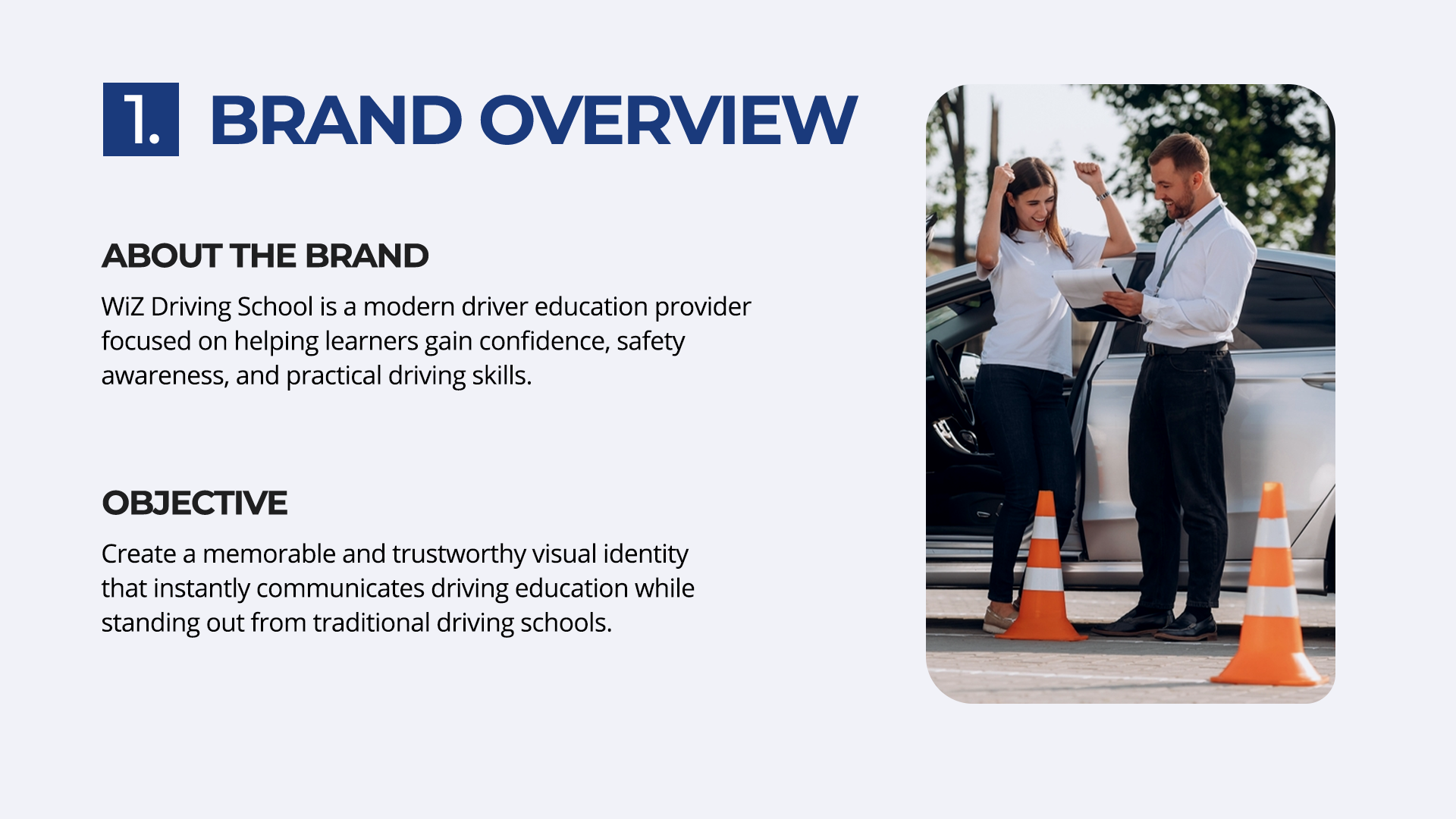
WiZ Driving School is a modern driver education provider dedicated to building learner confidence, promoting road safety awareness, and instilling practical driving skills. The objective of this rebrand was to establish a memorable, professional, and trustworthy visual identity that clearly communicates driving education while setting the brand apart from outdated, generic traditional driving schools.
Key Objectives
- Establish Visual Trust: Craft a premium, dependable visual identity that communicates reliability and modern driving education to both learner drivers and parents.
- Differentiate from Competitors: Move away from generic, outdated driving school logos by creating an original mark that seamlessly integrates key driving elements—road lanes, steering wheels, and instructional iconography.
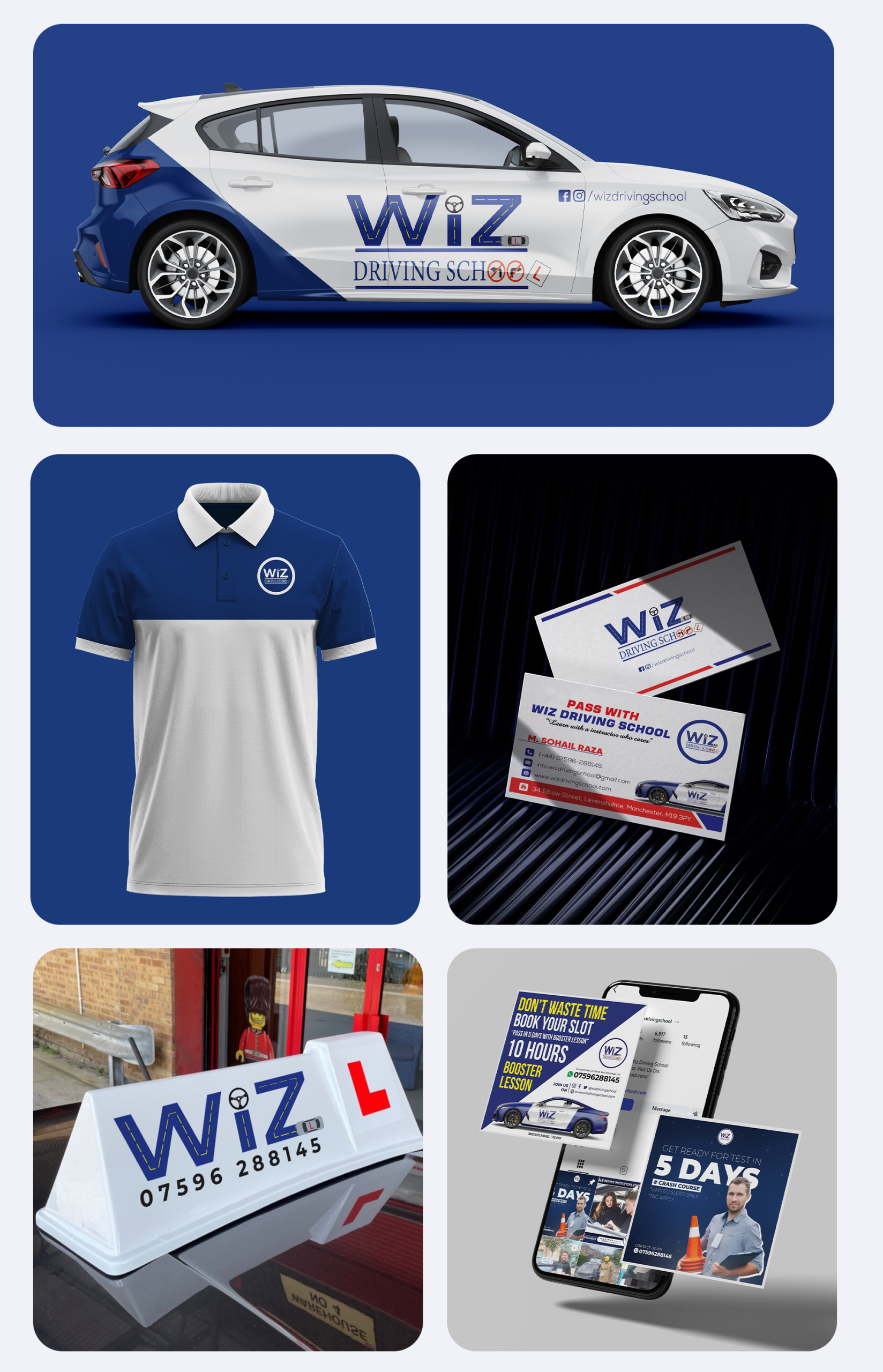
- Ensure High-Visibility Application: Design a cohesive, high-contrast branding system optimized for real-world touchpoints, including vehicle wraps, roof signage, instructor apparel, and digital marketing materials.
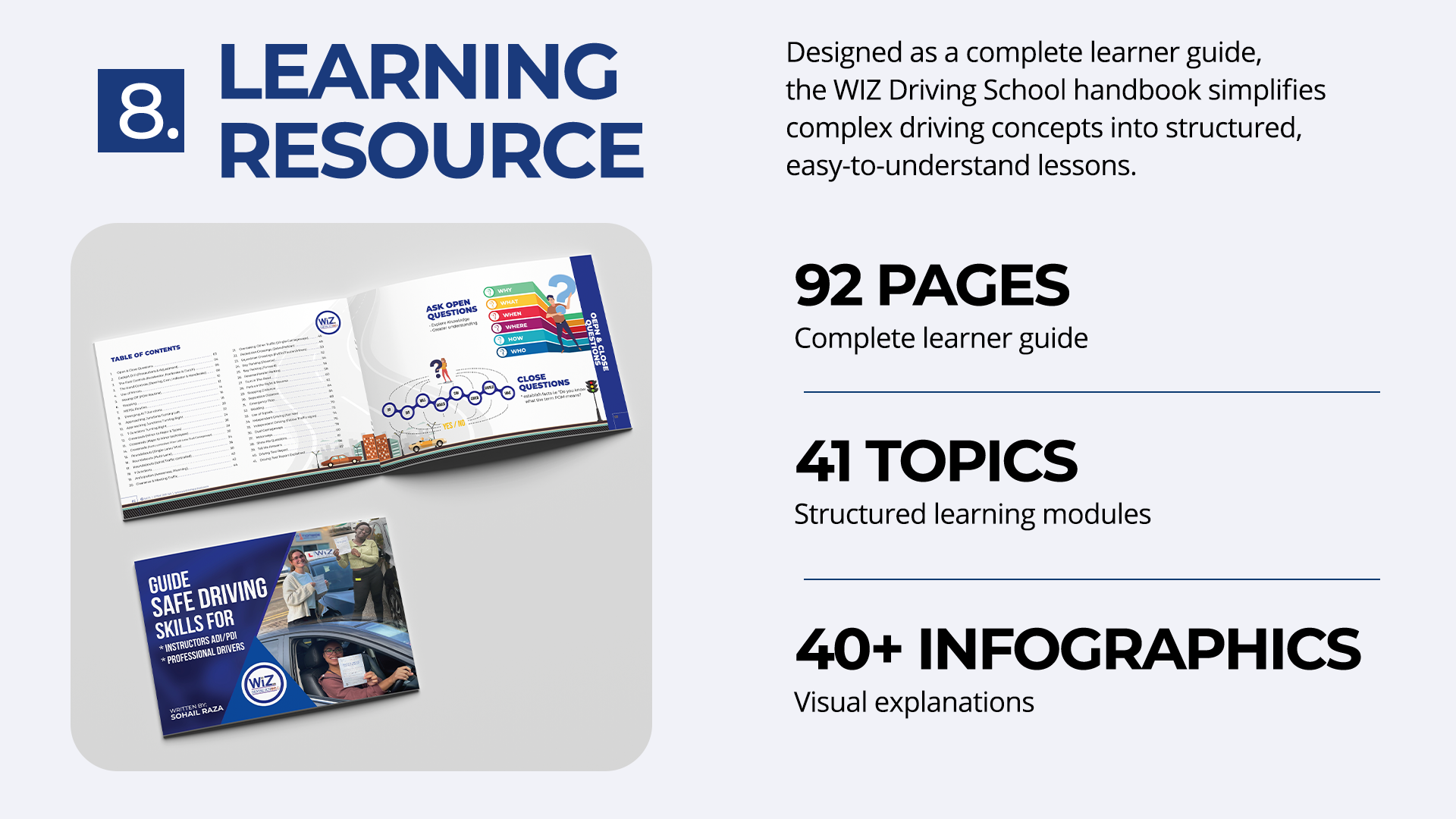
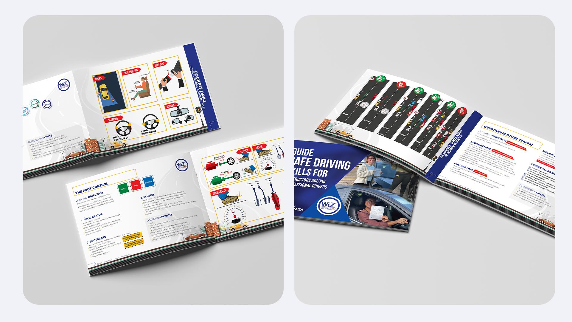
- Support Learner Education: Extend the brand identity into structured, practical learning resources and handbooks that build student confidence and guide them toward pass success.
The Challenge & Market Position
The driver education market is saturated with legacy schools relying on generic stock icons, dated visual aesthetics, and fragmented brand presence. My goal was to equip WiZ Driving School with a modern identity system that communicates trust, professional safety standards, and engaging instruction to both young learners and their parents.
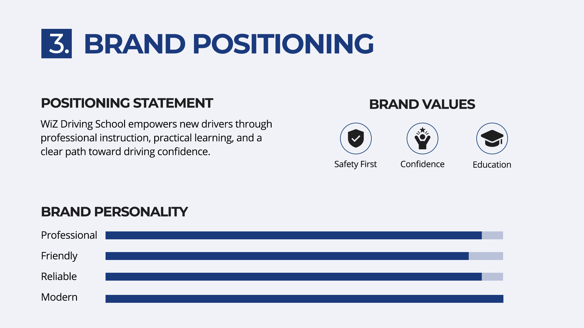
I positioned the brand at the intersection of structure and approachable learning, bridging the gap between official road safety standards and a stress-free student experience. My strategic objective was to establish a distinctive visual system that commands attention on the road while projecting reliability, authority, and modern instructional quality.
Core Requirements:
Distinctive Brand Mark: I set out to develop an original typographic logo that integrates iconic driving symbols without cluttering the overall visual balance.
High-Visibility Livery: I designed dynamic vehicle wraps optimized for clear legibility on live test routes and in heavy traffic.
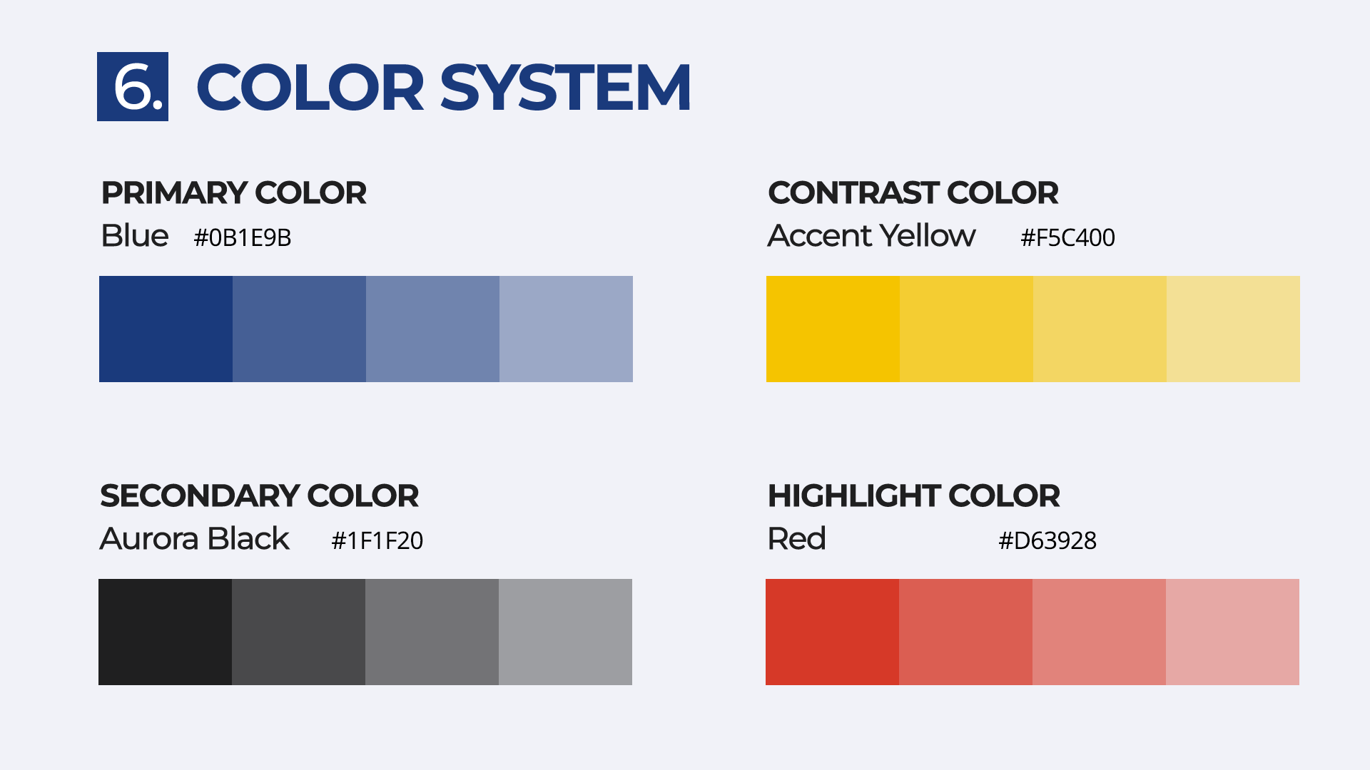
Comprehensive Palette: I defined a functional color matrix that reflects road safety, high contrast, and energetic confidence.
Unified Learning Materials: I created custom educational collateral, including handbooks and traffic sign guides, to maintain brand consistency throughout the student journey.
Scalable Asset System: I ensured the logo and secondary marks adapt seamlessly across uniforms, rooftop signage, digital marketing, and print touchpoints.
CONCEPT EXPLORATION & PROCESS
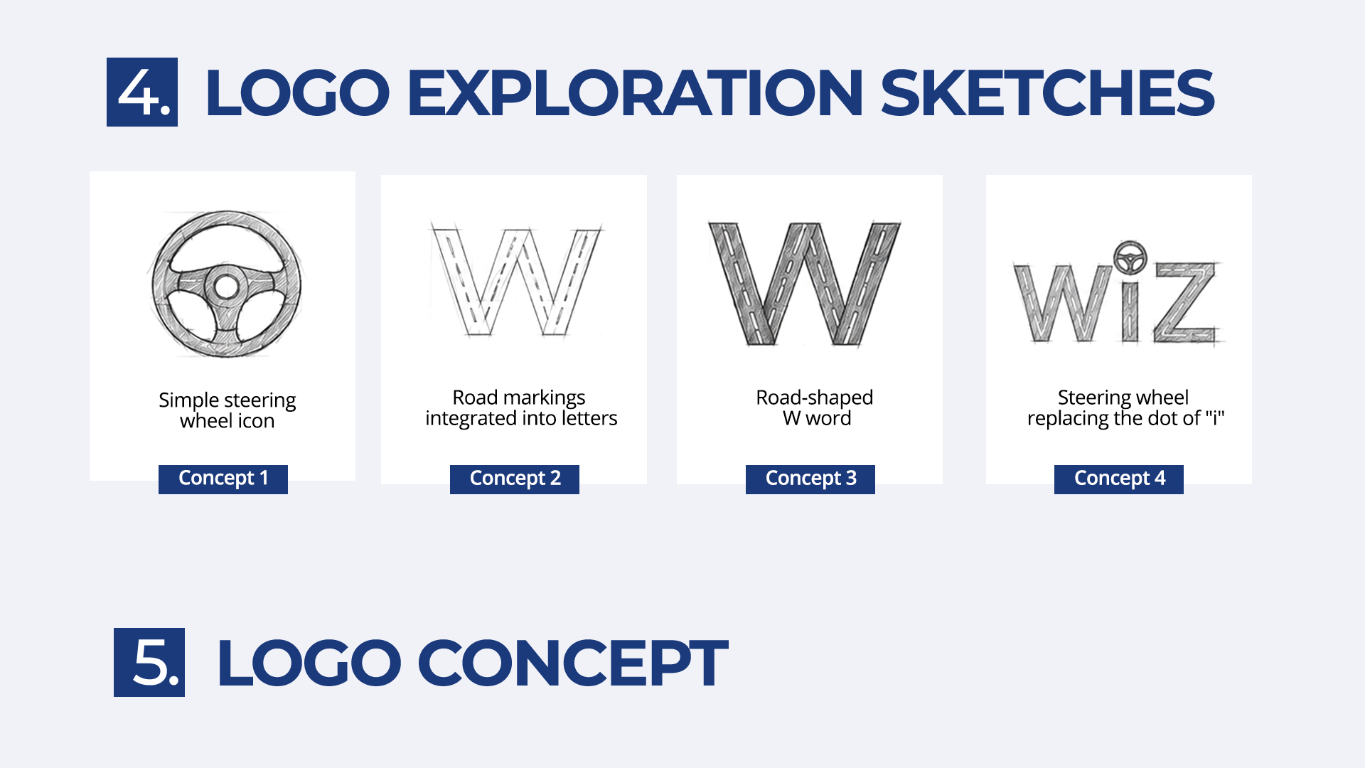
In my design process, I focused on translating physical road elements into simple, recognizable graphic metaphors. I began by exploring initial sketches of simple steering wheel shapes, road-shaped lettering, and instructional icons. I achieved my main breakthrough by synthesizing four core visual ideas directly into custom typography:
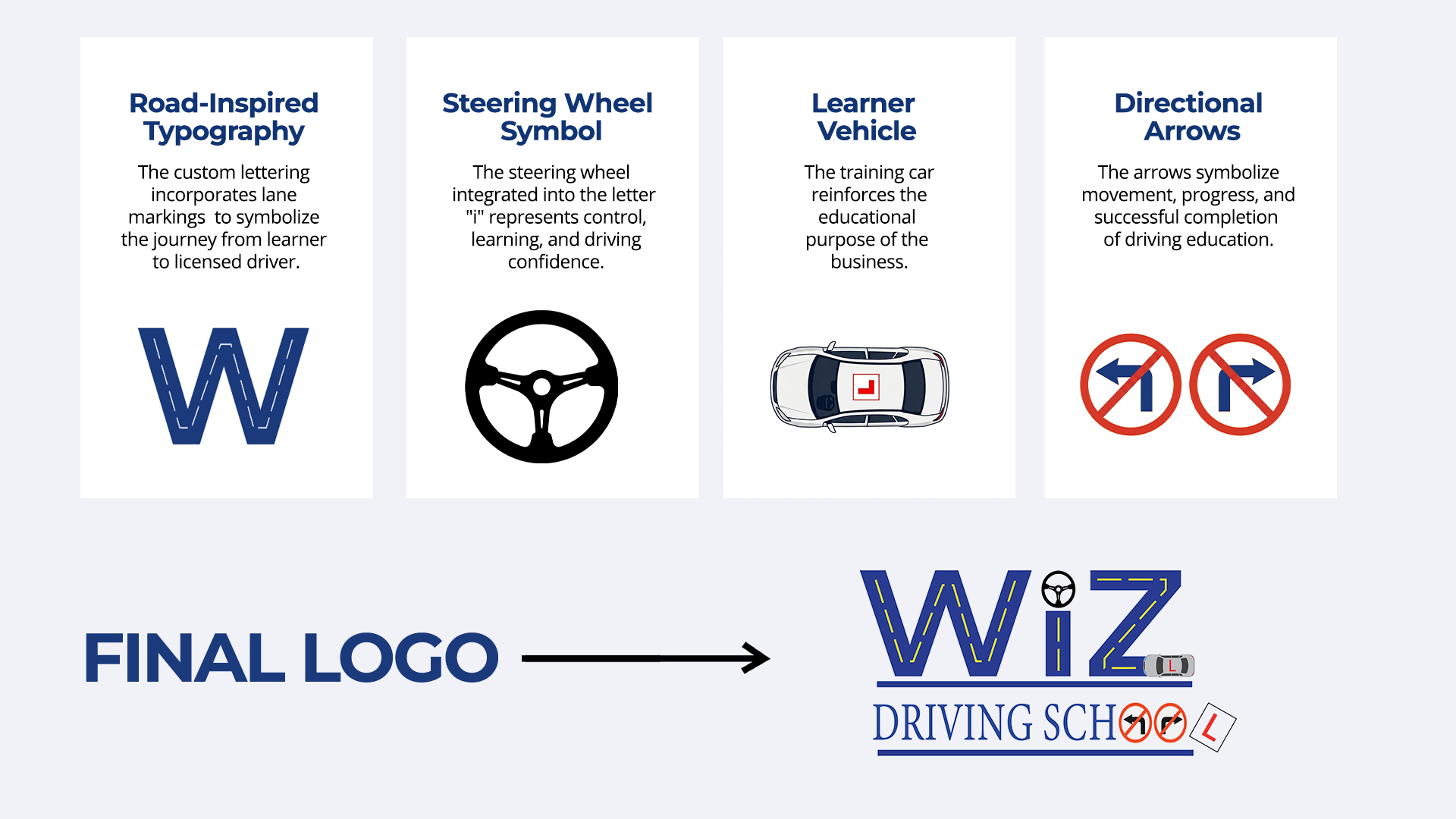
- Road-Inspired Lettering: I integrated dashed center-lane markings into the primary letterforms to symbolize a student’s progress toward becoming a licensed driver.
- Steering Wheel Integration: I replaced the dot over the “i” with a custom steering wheel icon to serve as a focal point for control and direction.
- Vehicle Silhouette: I added a top-down view of a training car complete with L-plates to establish immediate business clarity.
- Instructional & Wayfinding Symbols: I incorporated directional arrows and standardized warning badges to highlight road safety and guidance.