Umer.
Skip to main content

Umer Shehbaz

ROTARACT DISTRICT 3271

Executive Summary

Rotaract District 3271, part of Rotary International’s global youth leadership network, connects young professionals and university students through community service, leadership development, and professional networking. Each Rotary year, an elected District Rotaract Representative (DRR) introduces a campaign theme to guide the district’s vision. For 2017, incoming leadership chose “Be the Change” as the district’s central message.

To support this mission, a comprehensive visual identity and campaign design system were developed. The system united Rotaract clubs across the district under a shared identity reflecting leadership, service, and positive community impact.

Key Objectives

The goal was to unify District 3271 under one cohesive “Be the Change” campaign identity. It modernized Rotary’s iconic gear emblem into a energetic visual mark for a youth audience. The system was designed to stay crisp and readable at any size, from app icons to event backdrops. Finally, it provided a complete suite of physical, print, and digital assets for district-wide use.

The Challenge & Market Position

The district needed more than an isolated campaign logo; it required a complete, flexible visual identity capable of representing the year’s leadership vision across all physical and digital touchpoints.

Chef Platters positions itself as a premium yet approachable destination where traditional recipes meet contemporary refinement. Every element reflects craftsmanship, quality ingredients, and warm family hospitality—encapsulated in the core tagline: “Authentic Indian Cuisine. Modern Dining Experience.”

Core Brief Requirements:

  1. Unique Campaign Identity: Build an original visual mark for “Be the Change” rather than relying on a standard Rotary logo variation.
  2. Balance Youthful Energy with Trust: Combine vibrant visuals for a youth demographic while respecting Rotary International’s established credibility.
  3. Multi-Scale Clarity: Ensure clear visibility across applications ranging from small social media icons to large event banners.
  4. Extensible System: Design a cohesive framework that applies seamlessly to award shields, certificates, prints, and digital campaigns.

DESIGN SYSTEM & IDENTITY ARCHITECTURE

01. Logo Concept & Mark Construction

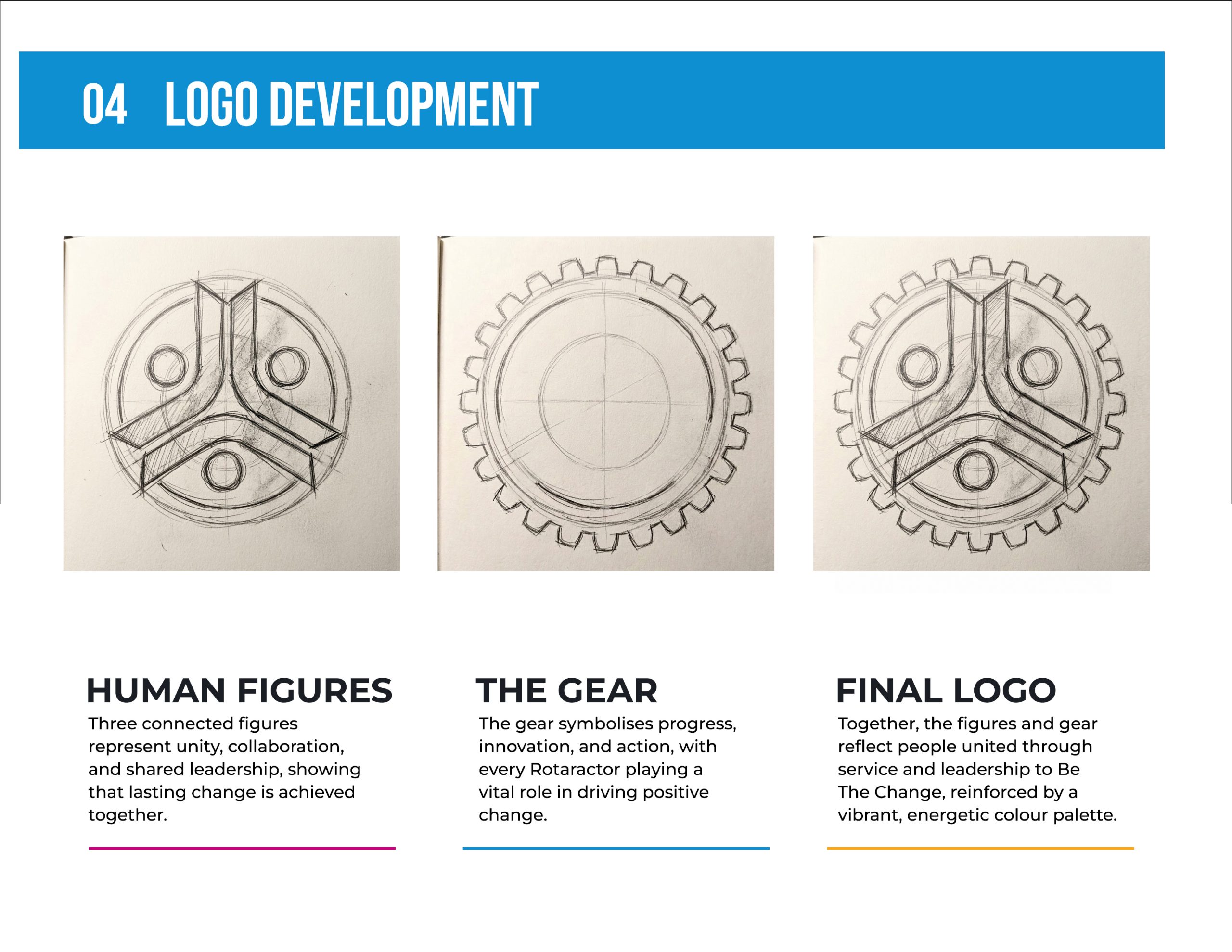
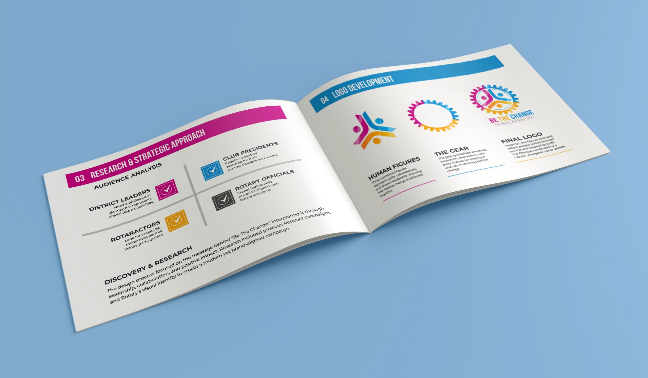
The final mark layers two core ideas into a unified emblem:

  1. Human Figures: Three connected figures in a triangular formation represent district leaders, club presidents, and Rotaractors collaborating as one united body.
  2. The Gear: The figures sit inside the iconic gear—Rotaract’s traditional symbol of service—representing progress, movement, and community action.
  3. Integrated Wordmark: The phrase “Be the Change” is color-matched directly to the three figures to form a cohesive, single-unit system.

Phase 2: Color Palette

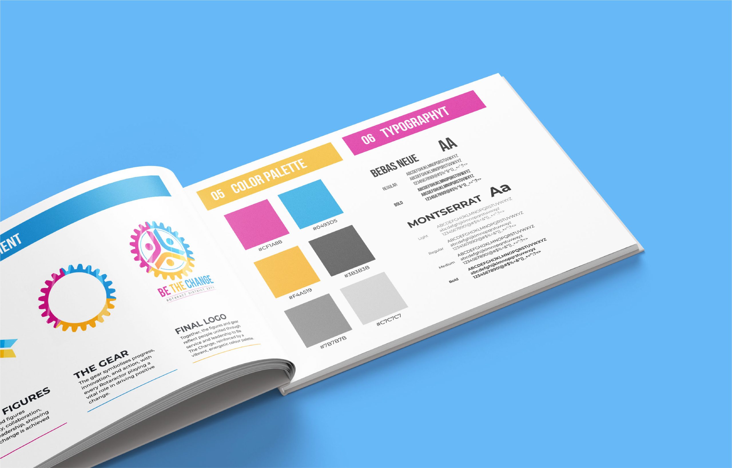
The primary palette utilizes three main colors assigned to each figure to make color a structural storytelling element:

  1. Magenta (#CF1A88): Represents passion, energy, and youth leadership.
  2. Cyan / Blue (#0493D5): Symbolizes trust, professionalism, and district unity.
  3. Gold / Yellow (#F4A519): Conveys optimism, service, and positive community impact.
  4. Supporting Neutrals: Dark Charcoal (#3B3B3B), Mid Gray (#7B7B7B), and Light Gray (#C7C7C7) for background structure and hierarchy.

Phase 3: Typography System

  1. Bebas Neue (Regular & Bold): Applied to the main “BE THE CHANGE” campaign title for maximum visual weight and bold presence.
  2. Montserrat (Light, Regular, Medium, Bold): Serves as the secondary typeface for subtitle text (“ROTARACT DISTRICT 3271”), maintaining high legibility across printed collateral and digital layouts.

DESIGN PROCESS & APPLICATIONS

Development & Refinement

  1. Exploration: Initial concepts explored various figure arrangements and gear tooth configurations.
  2. Proportion Refinement: Selected concepts were refined to balance gear-tooth rhythm and figure symmetry, ensuring readability across both small digital stamps and large event backdrops.
  3. Variations: Formats included full-color original, solid black, and reversed white marks for flexible background application.

Touchpoint Implementations

  1. Recognition & Awards: Custom acrylic award shields featuring the engraved gear mark and campaign typography.
  2. Event & Print Media: District campaign guidelines brochure, certificates, posters, and print collateral.
  3. Digital Media: Standardized social media templates, district announcements, and digital campaign graphics.

RESULTS & IMPACT

  1. Unified District Identity: Provided Rotaract clubs across District 3271 with a singular, recognizable brand for the entire 2017 term.
  2. Brand Consistency: Maintained visual alignment across event staging, physical awards, print guidelines, and digital communications.
  3. Balanced Aesthetic: Successfully bridged the gap between energetic youth engagement and Rotary International’s professional standards.