Umer.
Skip to main content

Umer Shehbaz

EMKAY LINE PREMIER LEAGUE

Executive Summary

Founded in 2008 in Karachi, Emkay Line has grown into a globally recognized shipping and logistics leader built on reliability and operational excellence. As an extension of its commitment to teamwork, the company launched the Emkay Line Premier League (EMPL)—a high-profile corporate cricket tournament uniting teams, sponsors, business partners, and cricket enthusiasts on one field.

Key Objectives

The objective was to craft a complete, high-impact visual identity and 360-degree branding architecture that captured the energy of competitive sports while maintaining a sleek, corporate-grade image across every physical and digital touchpoint.

The Challenge & Market Position

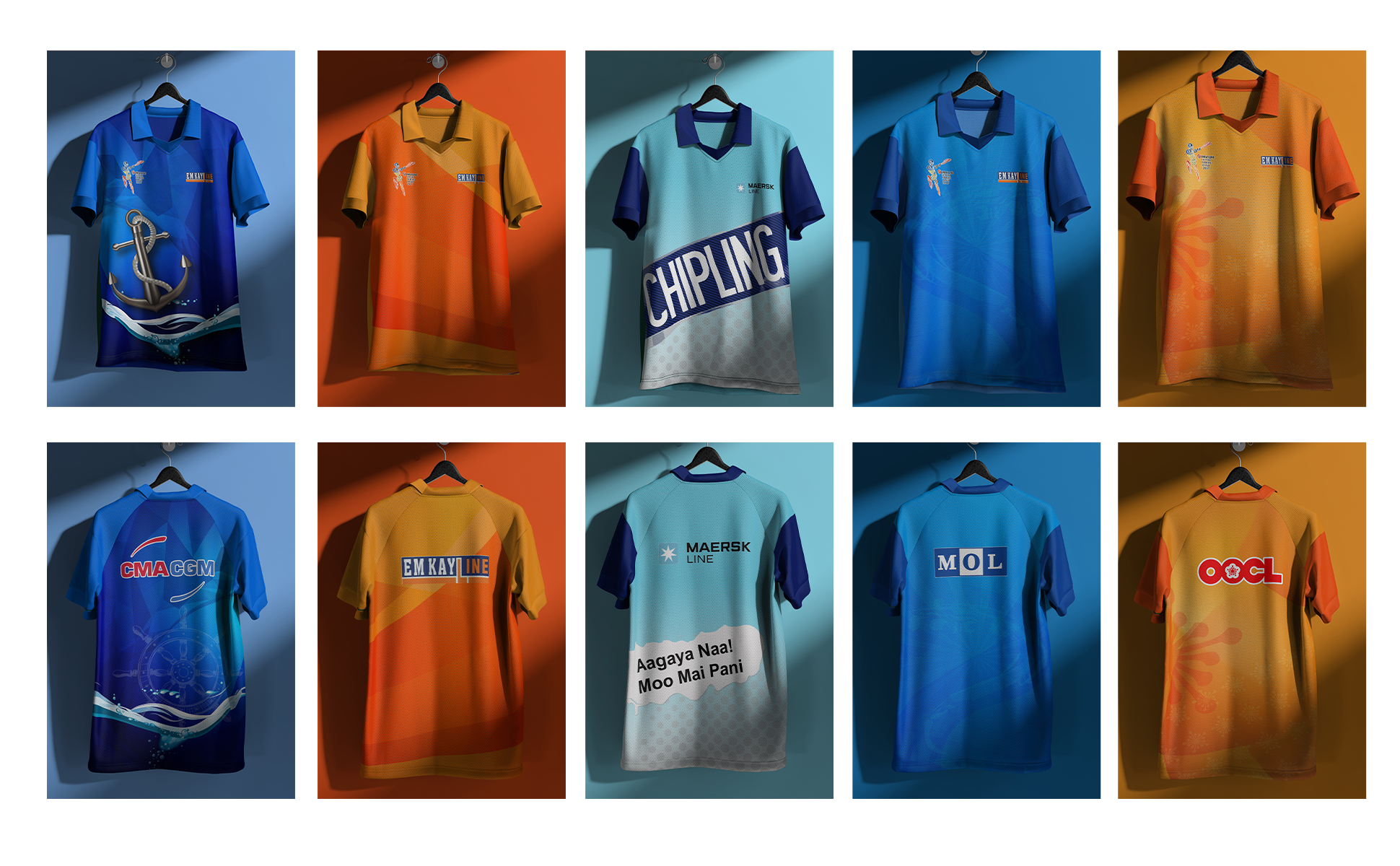
Corporate sports tournaments often struggle to balance corporate professionalism with athletic energy. Emkay Line needed a cohesive identity system that could smoothly integrate diverse corporate sponsors (including major shipping lines like Maersk, Safmarine, CMA CGM, OOCL, MOL, APL, and KMTC) without cluttering the visual hierarchy or weakening the core league brand.

Core Requirements:

  1. Develop a flexible design system capable of scaling across digital marketing, physical merchandise, and large-format stadium branding.
  2. Ensure clear sponsor placement without cluttering team uniforms or event signage.
  3. Maintain visual alignment with Emkay Line’s corporate identity using a vibrant orange and deep blue palette.

DESIGN SYSTEM & IDENTITY ARCHITECTURE

01. Logo Concept & Mark Construction

The primary event mark was engineered to balance corporate identity with dynamic sports performance:

  1. Emkay Line Wordmark: Incorporates the parent company’s established logotype to maintain brand equity and corporate backing.
  2. The Vertical Accent Bar: Acts as a visual bridge connecting “Emkay” and “Line,” introducing structured balance to the mark.
  3. League Typography: Bold, high-contrast block lettering (“SHIPPING PREMIER LEAGUE”) designed for clear visibility across field-level signage and player jerseys.
  4. Integrated Sports Motif: Incorporated cricket bat, ball, and wickets elements across variant badges to instantly communicate tournament energy.

Phase 2: Color Palette

The color system draws directly from maritime logistics heritage paired with high-visibility athletic aesthetics:

  1. Navy & Deep Slate: #002D62, #1E293B (Provides corporate structure, reliability, and grounded depth).
  2. Vibrant Safety Orange: #FF5722, #E64A19 (Evokes athletic energy, movement, and prominent field visibility).
  3. Athletic Cyan & Blue: #00BCD4, #0288D1 (Adds high-contrast vibrancy for player jerseys and digital matchday graphics).
  4. Crisp Neutrals: #FFFFFF, #F1F5F9 (Ensures high contrast for sponsor logos, body copy, and stadium backdrops).

Phase 3: Typography System

A bold sports-typographic pairing delivers maximum readability and impact:

  1. Montserrat (SemiBold, Bold, ExtraBold): Applied for prominent event headers, player names, scoreboards, and stadium backdrop displays.
  2. Poppins (Regular, Medium, SemiBold): Used for clean body copy, tournament fixtures, rulebooks, and digital social media stats.

RESULTS & IMPACT

  1. Unified Brand Presence: Delivered a single, cohesive brand identity across all media platforms throughout the tournament.
  2. Enhanced Event Experience: Created an immersive, professional sports league atmosphere for players, sponsors, and attendees.
  3. Sponsor Visibility: Improved promotional placement and presentation for corporate partners.
  4. Long-Term Recognition: Established a scalable visual system built to support future seasons of the league.