Umer.
Skip to main content

Umer Shehbaz

WEALTH WAVELENGTH

Executive Summary

Wealth Wavelength is a life insurance agency founded by Clyde Davidcarv, built on the Infinite Banking Concept. The strategy allows clients to utilize whole life insurance policies to build and borrow against their own wealth. Designed to serve young families—particularly within the Hispanic/Latino demographic—the brand requires a visual identity that bridges financial authority with personal accessibility.

Key Objectives

To create a distinct financial brand, the strategy focused on four key goals:

  1. Move away from generic industry tropes like shields, handshakes, or gold-and-serif combinations.
  2. Balance financial stability with approachable warmth for young, family-oriented clients.
  3. Visually express both the fluid concept of a “wavelength” and the cyclical, infinite nature of wealth building.
  4. Deliver a flexible identity that scales across digital interfaces, print collateral, and physical merchandise.

The Challenge & Market Position

Traditional insurance and financial branding frequently falls into stereotypical patterns—appearing either overly corporate and distant or clichéd with repetitive safety imagery. Wealth Wavelength needed to introduce complex private-banking concepts in a way that felt personal, trustworthy, and modern.

Core Requirements:

  1. Express the name “Wealth Wavelength” through movement, rhythm, and stability.
  2. Avoid cold corporate corporate styling while maintaining a premium feel.
  3. Ensure the identity translates smoothly across stationery, app icons, and promotional assets.

CONCEPT EXPLORATION & PROCESS

The identity developed through three distinct concept directions before landing on the final execution:

  1. 1st Concept: A gold infinity loop using a classic serif—direct, but felt expected for the category.

  2. 2nd Concept: Abstract, dark minimal flowing lines paired with a geometric sans-serif—clean, but skewed cold and corporate.

  3. 3rd Concept: A circular badge folding water lines into a letter “W”—closer in structure, but the all-blue palette lacked approachable warmth.

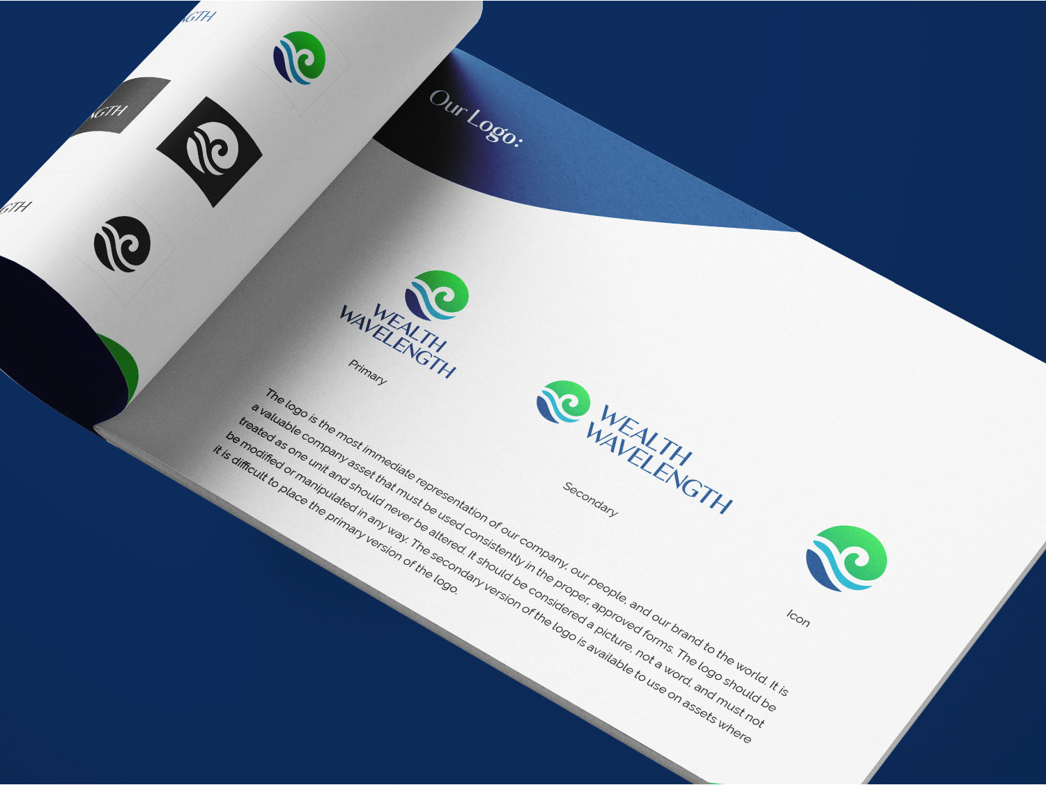
  4. Final Mark: Resolves the explorations into a swirling wave-and-globe icon. It transitions from vibrant green into deep blue within a continuous form, paired with a navy serif wordmark.

DESIGN SYSTEM & IDENTITY ARCHITECTURE

Phase 01. Logo Concept & Mark Construction

  1. The Swirl Icon: Combines the fluid rhythm of a wavelength with the structure of a globe/circle.
  2. Integrated “W” Lines: Water movement seamlessly forms a subtle “W” while representing continuous wealth flow.

Phase 2: Color Palette

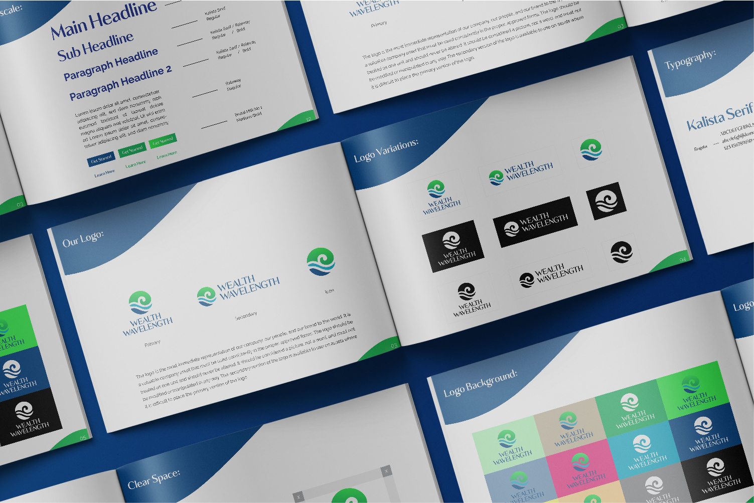
  1. Vibrant Green: Represents growth, prosperity, and vitality.
  2. Deep Navy & Blue: Conveys stability, trust, and financial security.
  3. Neutrals: Soft off-white and charcoal tones for clean typographic balance.

Phase 3: Typography System

  1. Kalista Serif: Primary headline typeface chosen for its confident, established weight and premium tone.
  2. Raleway: Secondary sans-serif typeface used for body copy, subheadlines, and stationery layouts to maintain clarity.

APPLICATIONS & TOUCHPOINTS

The visual identity was expanded into a brand suite and guideline manual:

  1. Brand Guidelines Book: Documenting logo clear space, background usage, typography scales, and color combinations.
  2. Corporate Stationery: Business cards, letterheads, and administrative documents using the signature wave graphic.
  3. Digital & Mobile Applications: Optimized app icons and web interfaces for client interaction.
  4. Apparel & Merchandise: Applied across promotional apparel, caps, mugs, and event flags.

RESULTS & IMPACT

  1. Distinct Market Positioning: Established a visual presence that reads as private banking while remaining approachable for young families.
  2. System Flexibility: Developed a versatile identity system that functions seamlessly across small digital screens, print collateral, and physical merchandise.
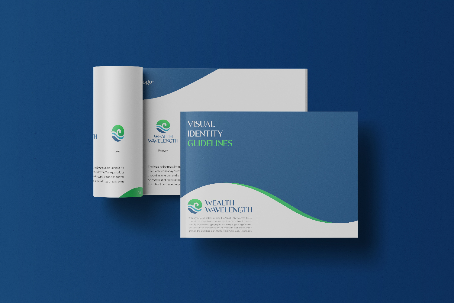
  3. Cohesive Brand Presence: Standardized all client-facing touchpoints under a unified visual strategy.