ROLLED ALLOYS
Industrial Visual Identity & Precision Brand System | Specialty Metals & Manufacturing
Executive Summary
Rolled Alloys is a global specialty metals supplier with seven decades of rich history and industry expertise. The rebrand successfully modernized their visual identity for an international audience while preserving the brand’s long-standing industrial authority. The strategy aligned their visual presentation with the global scale of their operations, enhancing communication with highly technical sectors like aerospace and energy.
Key Objectives
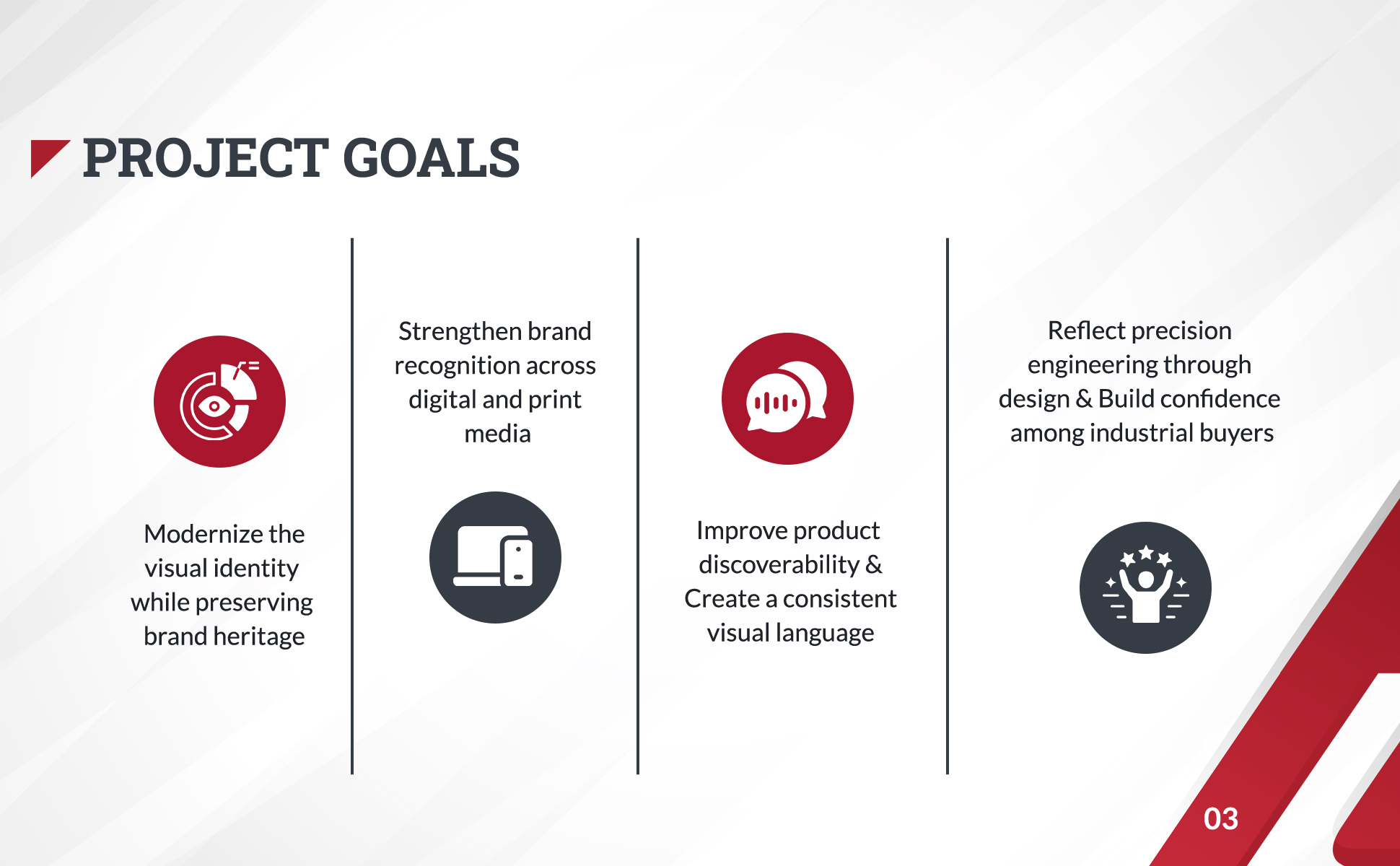
- Modernize Brand Heritage: Update a 70-year-old legacy brand’s visual identity to reflect modern standards without losing its heavy-industry credibility.
- Reflect Engineering Precision: Create a robust brand framework that communicates stability and precision to procurement decision-makers in high-stakes sectors.
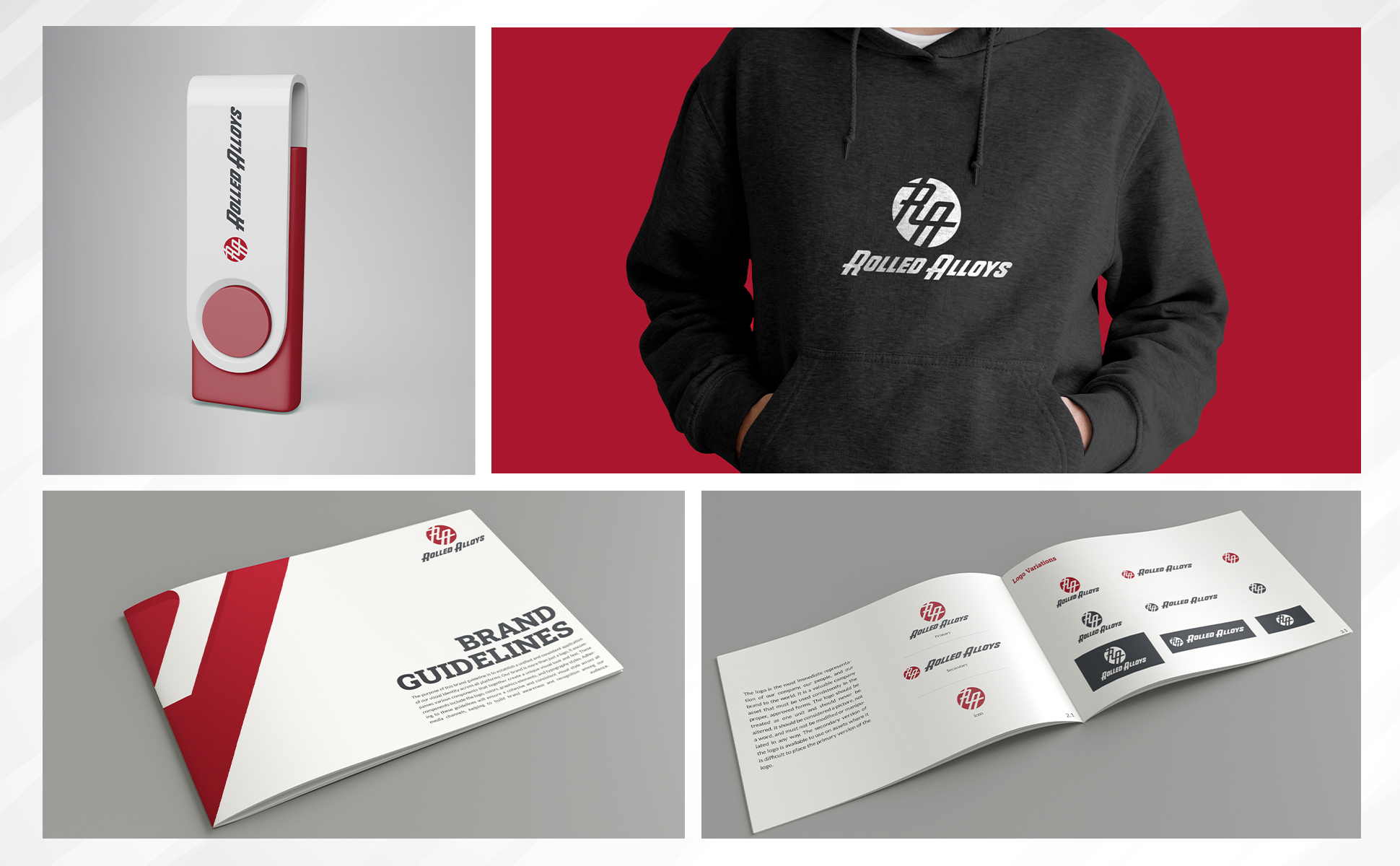
- Ensure Multi-Platform Consistency: Establish precise color specifications (RGB, CMYK, Pantone, Hex) and brand guidelines to ensure consistency across global facilities.
The Challenge & Market Position
Industrial suppliers frequently face unique branding hurdles: presenting technical products clearly, organizing vast product catalogs, and communicating decades of expertise without appearing dated. The primary challenge for Rolled Alloys was bridging technical rigors with a modern aesthetic that builds immediate confidence with B2B buyers.
Rolled Alloys positions itself as a market leader where material science meets operational dependability. The visual identity system emphasizes strength, agility, and precision, driving home the brand promise: “Quote. Buy. Track. It’s that easy!”
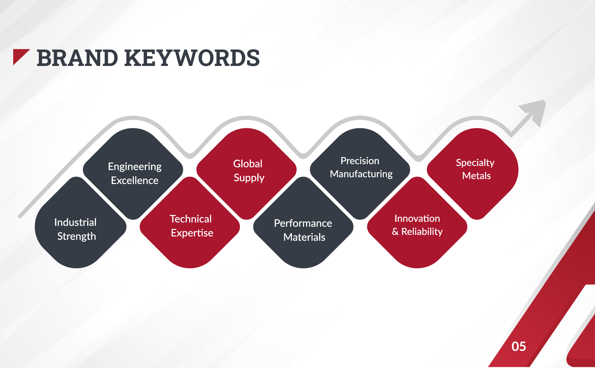
BRAND KEYWORDS & STRATEGIC FOUNDATION
The strategic framework focuses on communicating strength, innovation, and global dependability through structured visual elements.
The identity is anchored by core brand values:
- Engineering Excellence & Industrial Strength
- Technical Expertise & Specialty Metals
- Precision Manufacturing & Innovation
- Global Supply & Dependable Performance
DESIGN SYSTEM & IDENTITY ARCHITECTURE
01. Logo Concept & Mark Construction
The Rolled Alloys logomark is an expressive custom monogram engineered for movement and industrial authority:
- Custom Initials (RA): Dynamic geometric lettering that delivers a bold, modern, and forward-moving identity.
- Circular Frame: Represents global operations, completeness, and end-to-end supply chain reliability.
- Angular Construction: Precise diagonal cuts and strong geometry convey technical precision and structural integrity.
- Scalable Geometry: Optimized for high legibility across small print, heavy machinery, packaging, and digital interfaces.
Phase 2: Color Palette
The color system reflects strength, technical precision, and industrial stability:
- Primary Red (#B4122B): Represents strength, energy, and high-performance materials.
- Charcoal Black (#2C313B): Conveys precision, professionalism, and engineering expertise.
- Dark Gray (#565C65): Provides stability, simplicity, and structural balance.
Phase 3: Typography System
A deliberate font combination balances authoritative presence with clear readability:
- Roboto Slab (Regular, Medium, Bold, Black): Serves as the primary display typeface. Robust, authoritative serifs anchor headlines and titles, reinforcing brand strength.
- Lato (Regular, Medium, Bold): A sleek, highly readable sans-serif typeface used for body text, data sheets, and digital UI, providing modern clarity.