Executive Summary
Chef Platters is a contemporary Indian restaurant founded by Chef Akbar Singh, whose 25+ years of culinary expertise have established his reputation across Manchester. The brand celebrates authentic Indian Street and Indo-Chinese cuisine through refined presentation, exceptional hospitality, and memorable dining experiences.
The objective was to craft a comprehensive visual identity system that reflects premium quality and culinary craftsmanship while remaining warm, welcoming, and deeply rooted in cultural authenticity.
Key Objectives
- The primary goal of this project was to establish a cohesive, modern visual identity for Chef Platters that elevates its market position from a local eatery to a premium dining destination. The objective was twofold: bridge the gap between traditional Indian culinary heritage and contemporary aesthetic standards, while creating a flexible, multi-touchpoint brand system. This meant designing an identity that performs effortlessly across eco-friendly physical packaging, in-restaurant collateral, and digital booking platforms—ensuring a unified, high-end experience for both dine-in guests and takeaway customers.
The Challenge & Market Position
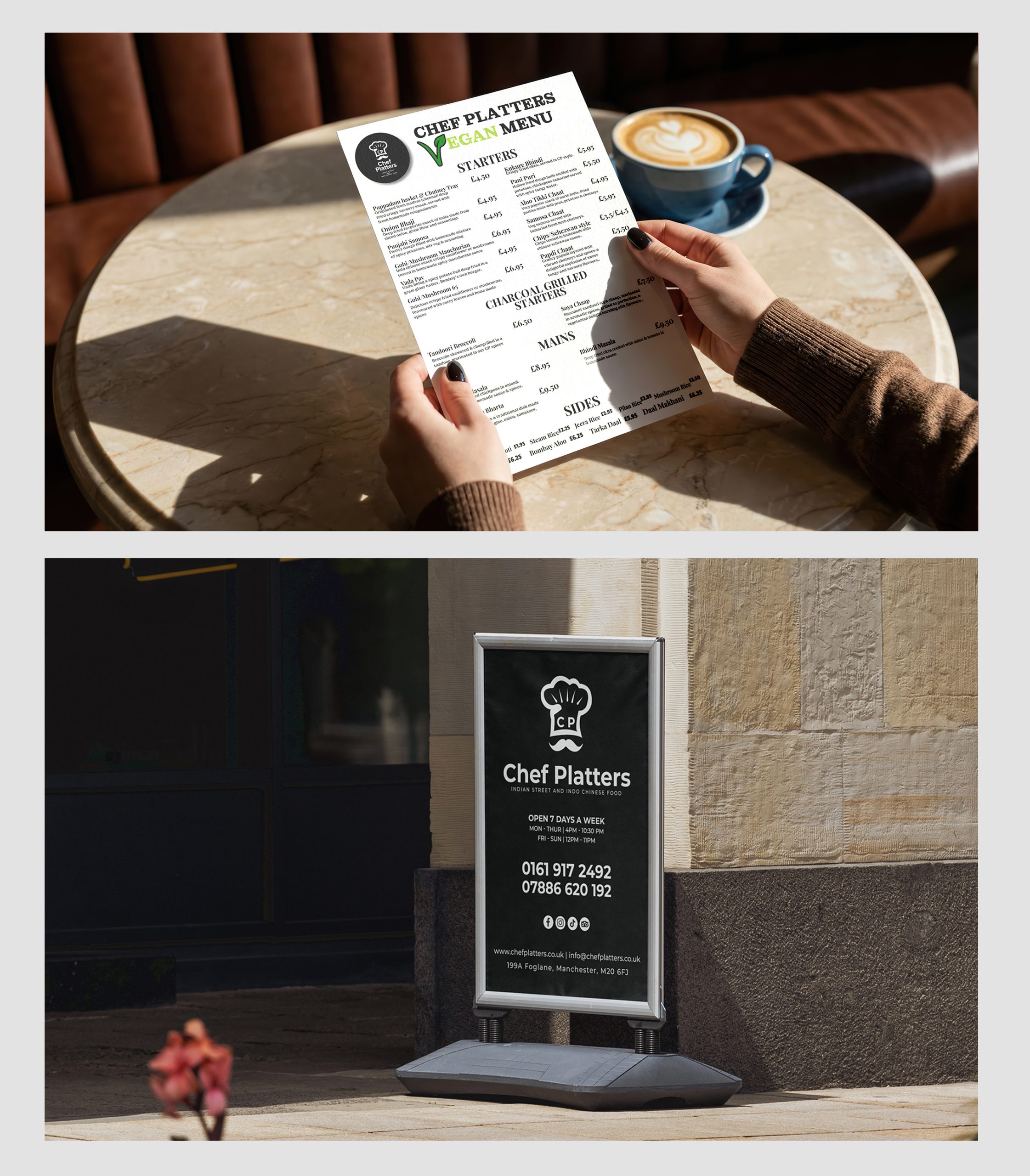
The existing brand needed an identity system capable of standing confidently alongside modern dining establishments while preserving its cultural heritage. The core challenge was to avoid generic Indian restaurant visuals and overused clichés, creating instead a timeless visual language that scales seamlessly across physical menus, eco-conscious packaging, exterior signage, digital platforms, uniforms, and interior spaces.
Market Positioning & Strategy
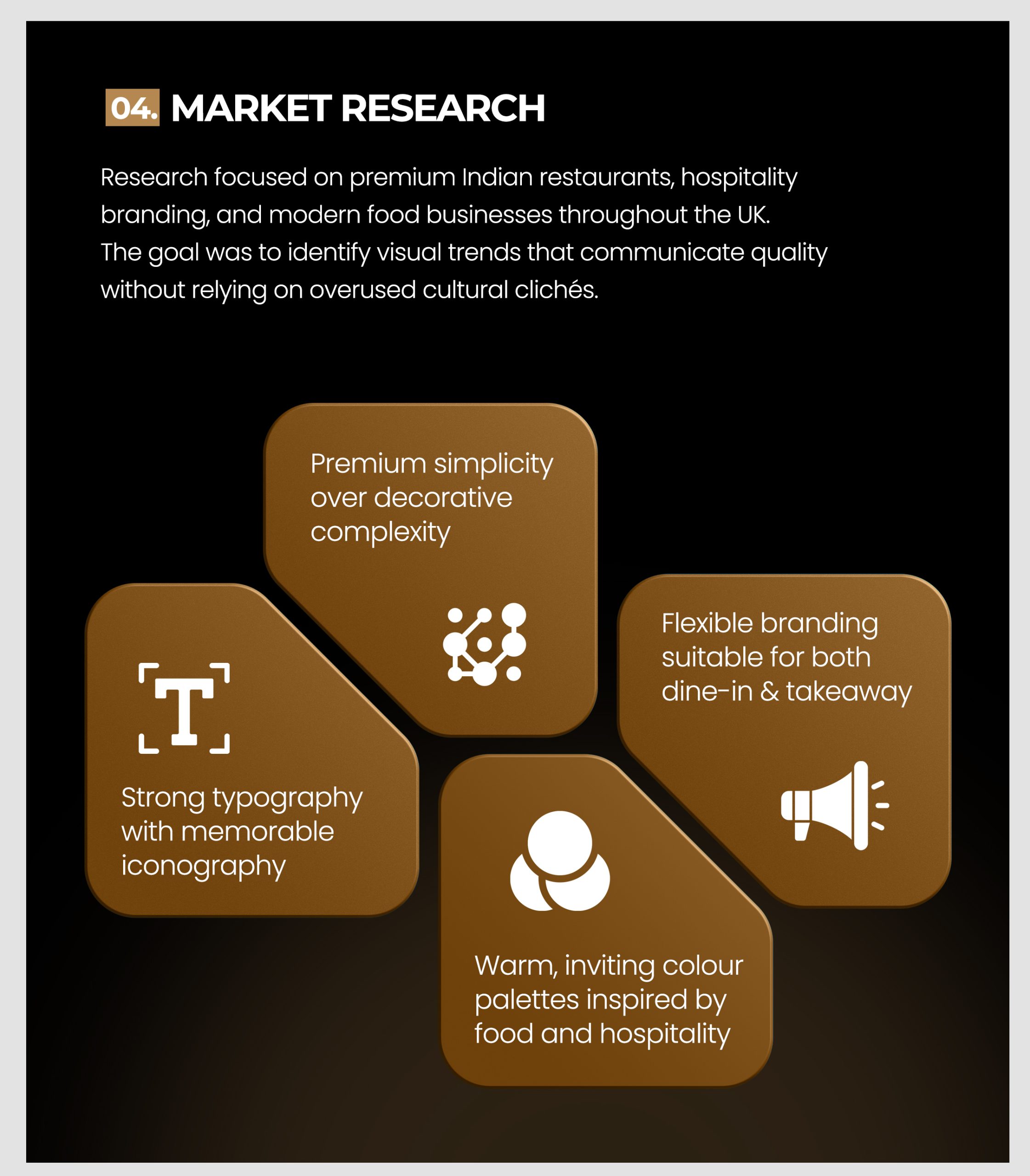
Research focused on premium Indian restaurants and modern hospitality brands across the UK to identify trends that communicate quality through premium simplicity over decorative complexity.
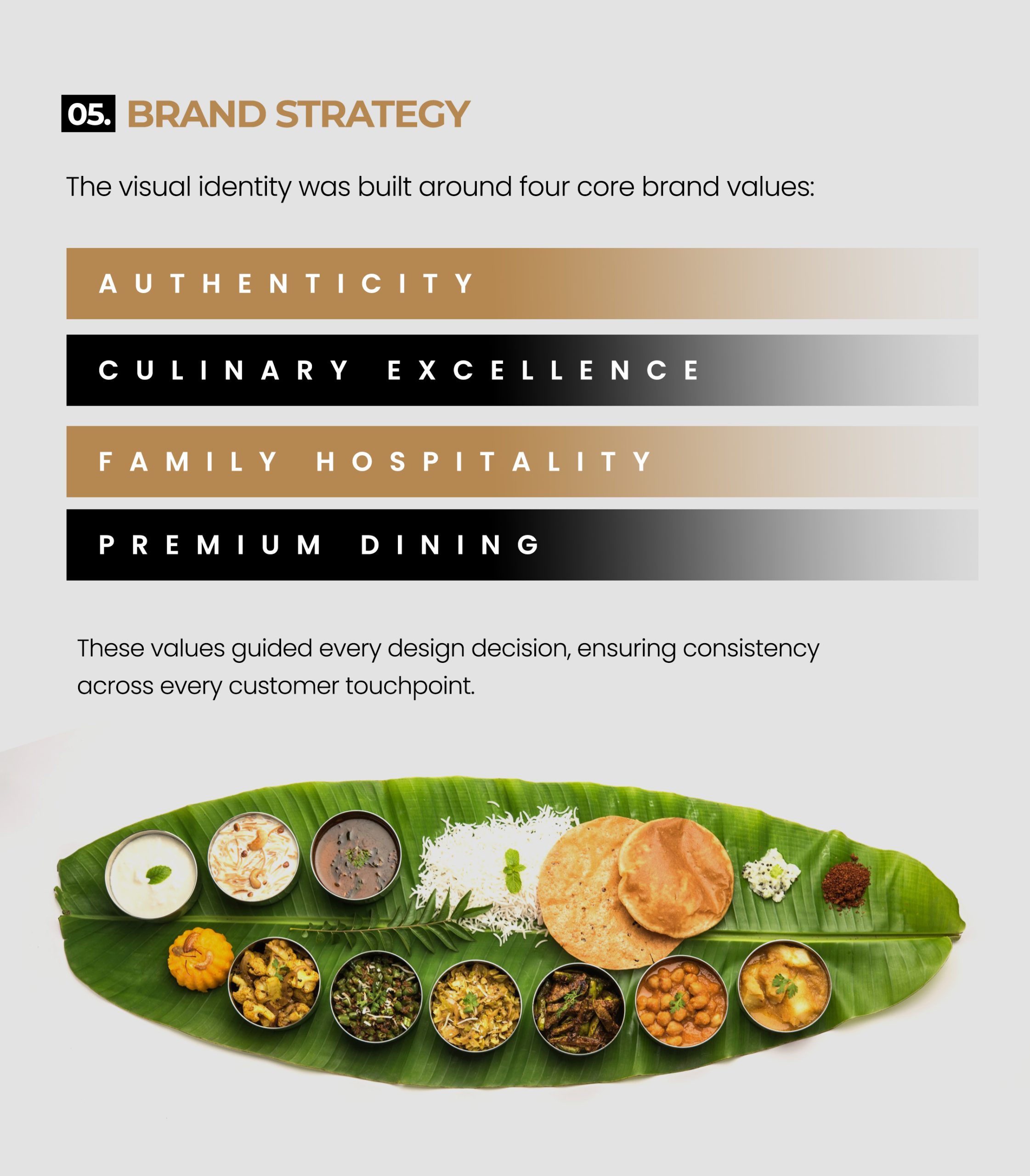
Chef Platters positions itself as a premium yet approachable dining experience guided by four core brand values:
- Authenticity: Honoring traditional Indian recipes and culinary origins.
- Culinary Excellence: Celebrating 25+ years of master craftsmanship and quality ingredients.
- Family Hospitality: Creating a warm, inviting atmosphere for all guests.
- Premium Dining: Elevating every customer touchpoint across dine-in and takeaway services.